Five years ago, the SwiftUI framework was revealed at WWDC19, offering developers a new way to build apps on Apple platforms.
Despite the framework’s infancy, its simplicity and clarity in developing user interfaces displayed incredible potential. That’s why when we started working on 1Password 8 in early 2020, we decided to go all-in on SwiftUI for our iOS app. After all, it was being touted as the future of UI development on Apple platforms.
Since then, SwiftUI has served us really well. It’s helped our team bring 1Password 8 for iOS to life and move quicker than ever in delivering new, exciting features to users. We’re having a great time with SwiftUI today but it hasn’t always been smooth sailing for everything we’ve needed to build. One of those things was our lock screen.
In this post, we’ll share our team’s experience of being early SwiftUI adopters through the lens of our lock screen. We’ll cover our initial struggles that led to an initial UIKit implementation, followed by our eventual SwiftUI reimplementation, which has made our lives much easier. It’s a peek behind the curtain at how we build 1Password and we hope it will help inform your own decisions about adopting SwiftUI.
The lock screen: How it started
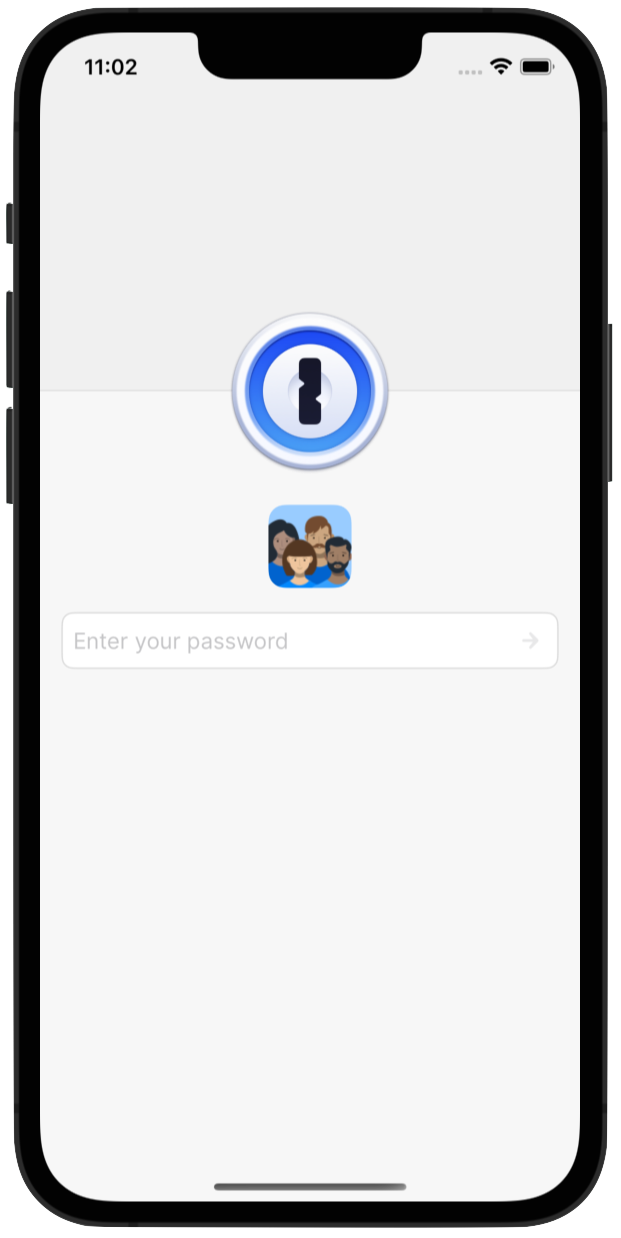
The 1Password lock screen is a deceptively complex piece of UI that has to adapt to a number of different sizes, orientations, locking modes, and account types. It’s also the first thing every user sees when they open the app, so it’s critical that we nail its implementation.
By the time we started the initial development of the lock screen, we had bumped up our minimum deployment target to iOS 14. That choice meant SwiftUI had already received its first major update.
However, the framework still had numerous limitations that we found difficult to overcome when it came to the lock screen portion of the app. The most notable roadblocks that we hit related to animations and layout.
Animations
Animations were problematic because we needed to chain a few of them together alongside asynchronous procedures on the lock screen. The unlock animation consists of the following steps that need to happen one after another:
- Partial rotation of the lock for the loading state
- Full rotation of the lock upon successful unlock
- The door opening effect
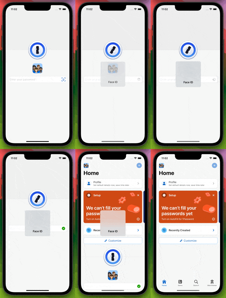
Each animation has different durations with specific delays in between them. We found these details messy to coordinate because SwiftUI, unlike UIKit, didn’t provide completion handlers for animation blocks.
These limitations started us down a road of creating a fragile chain of events that had to be controlled by numerous magic numbers for delays and dispatching asynchronously to the main queue.
Certainly not a tenable nor maintainable situation.
Layout
The other can of worms was the implementation of our lock screen layout on larger devices such as the iPad. The design called for the following specifications:
- The account password field needs to be placed vertically and horizontally centered within the available area.
- The account avatar row and status message should be placed a fixed vertical distance above/below the anchored account password field.
- The lock needs to be horizontally placed a fixed distance from the leading edge of the account avatar row. Its center should be vertically aligned to the center of the account avatar row.
- The left door’s trailing edge needs to be aligned horizontally to the center of the lock.
- The right door’s leading edge should be aligned horizontally to the center of the lock.
This set of layout requirements is a cakewalk to implement with UIKit’s Auto Layout constraints. But could we accomplish the same layout with SwiftUI? Our team was still in the process of pulling ourselves away from our UIKit brains and ramping up on SwiftUI. So we had a difficult time getting this right. The task went well beyond the simple use of vertical and horizontal stacks and although we knew of alignment guides, it wasn’t clear how to replicate the amount of control that Auto Layout had.
Alongside these two roadblocks, we encountered other difficulties. For example, we couldn’t control text field focus, and there wasn’t a simple way to support a flow layout for the account avatars.
Taking all of these challenges into consideration, we decided to fall back to UIKit for our lock screen experience and revisit SwiftUI when the framework was more mature. Although this meant some additional code to interface between the lock screen (UIKit) and the rest of the app (SwiftUI), it was the best way to keep moving forward.
The UIKit lock screen in 2023
Let’s fast forward to 2023. 1Password 8 for iOS had been released and the UIKit-powered lock screen had been in service for a few years. How was it faring?
The rest of the 1Password app had moved on to an almost exclusively SwiftUI-based implementation. New features, components, and utilities were all being built with SwiftUI in mind but these advancements would never make their way to the lock screen. In some cases, we even had to recreate some of our SwiftUI components in UIKit to get the consistency we needed between the lock screen and the rest of the app.
As time marched on, our requirements slowly changed and new features were added to the lock screen as hosted SwiftUI views. We found ourselves doing quite a bit of extra work to get the UIKit implementation to behave nicely with the rest of the app. Slowly, the lock screen code ballooned into a fragile behemoth that was difficult to work with. Debugging became a nightmare and fixing one bug would often lead to another. The lock screen was being crushed under the weight of its own tech debt, which made it clear to us that it was time for a course correction.
The move to SwiftUI
Clearly, we needed a large refactor to break out of this tech debt cycle and figure out how to implement the lock screen in a smarter, easier to maintain fashion. Ideally this refactor would be done entirely in SwiftUI to make the implementation more homogenous with the rest of the app.
So the questions we had to ask ourselves were: “Are we still bound by the same challenges we had with SwiftUI a few years ago? What has changed since then?” We had been following SwiftUI’s advancements and found ourselves in a promising position once we bumped up our minimum deployment target to iOS 16.
New layout APIs
Moving up our minimum deployment target was a huge help. Multiple versions of SwiftUI had gone by and the framework had made great strides since then.
We got access to new layout tools such as ViewThatFits and the ability to create custom layout containers using the Layout protocol, which allowed us to easily replace the UICollectionView used for the flow layout in the account avatar row. In the UIKit implementation we had to worry about a variety of implementation details such as recomputing view dimensions after device orientation changes, hooking up data sources and ensuring they are reloaded appropriately, and enabling/disabling horizontal scrolling when necessary. The declarative nature of SwiftUI meant we no longer had to worry about all that! We even had a HorizontalFlowLayout written for displaying the tags of an item that could be reused here.
All of those concerns we had to worry about in the UIKit implementation were automatically addressed in SwiftUI by just declaring what we want on the screen – and without a Storyboard in sight!
struct LockScreenAccountAvatarsView: View {
	// ...

	var body: some View {
    	switch layoutMode {
        	case .small:
            	horizontalScroll
        	case .medium, .large:
            	horizontalFlow
    	}
	}

	@ViewBuilder private var horizontalScroll: some View {
    	ViewThatFits(in: .horizontal) {
        	content

        	ScrollView(.horizontal, showsIndicators: false) {
            	content
        	}
    	}
	}

	@ViewBuilder private var content: some View {
    	HStack(spacing: Self.avatarSpacing) {
        	ForEach(accounts) { account in
            	LockScreenAccountAvatarsCellView(
                	account: account,
                	iconSize: iconSize
            	)
        	}
    	}
	}

	@ViewBuilder private var horizontalFlow: some View {
    	HorizontalFlowLayout(spacing: Self.avatarSpacing) {
        	ForEach(accounts) { account in
            	LockScreenAccountAvatarsCellView(
                	account: account,
                	iconSize: iconSize
            	)
        	}
    	}
	}
}
Swift evolution
Not only has SwiftUI evolved over time, but the Swift language itself has as well. For example, the introduction of Swift Concurrency and async-await was an immense help in writing asynchronous procedures in a readable and easy-to-maintain way. While we didn’t have access to completion handlers for SwiftUI animations in iOS 16, coordinating animation durations and delays became a breeze with async-await.
@MainActor func animate(
	animationCurve: AnimationCurve,
	duration: CGFloat,
	delay: CGFloat = 0,
	_ body: @escaping () -> Void
) async {
	if #available(iOS 17, *) {
    	withAnimation(animationCurve.curve(duration: duration).delay(delay)) {
        	body()
    	} completion: {
        	continuation.resume()
    	}
	} else {
    	withAnimation(animationCurve.curve(duration: duration).delay(delay)) {
        	body()
    	}

    	DispatchQueue.main.asyncAfter(deadline: .now() + duration + delay) {
        	continuation.resume()
    	}
	}
}
func openDoors() async {
	await rotateKeyhole(to: .full)
	await animate(
    	animationCurve: Self.doorOpeningAnimationCurve,
    	duration: Self.doorOpeningDuration,
    	delay: Self.keyholeRotationToDoorOpeningDelay
	) {
    	self.areDoorsOpen = true
	}
}
func rotateKeyhole(to keyholeRotation: LockScreenKeyholeRotation) async {
	await animate(
    	animationCurve: Self.keyholeRotationAnimationCurve,
    	duration: keyholeRotation.duration
	) {
    	self.keyholeRotation = keyholeRotation
	}
}
Considering the previous implementation involved numerous callbacks combined with Combine publishers, this was a major step up in making everything easier to understand.
Growing alongside SwiftUI
As SwiftUI evolved throughout the years, so did our familiarity with the framework and its new paradigms. The layout system was less of a mystery (especially since the introduction of the Layout protocol) and best practices became second nature.
The previous layout constraints of the lock screen – which we could only imagine implementing in Auto Layout – started to have clear solutions in SwiftUI.
Let’s see how we can implement the layout constraints in the section above with SwiftUI. To get started, we’ll just slap everything onto the screen:
var body: some View {
	ZStack {
    	logo

    	controls
	}
	.background {
    	HStack(spacing: .zero) {
        	leftDoor
        	rightDoor
    	}
	}
}

@ViewBuilder private var controls: some View {
	VStack(alignment: .leading, spacing: Self.controlsSpacing) {
    	avatarRow

    	passwordField

    	statusMessage
	}
	.frame(width: Self.controlsWidth)
}
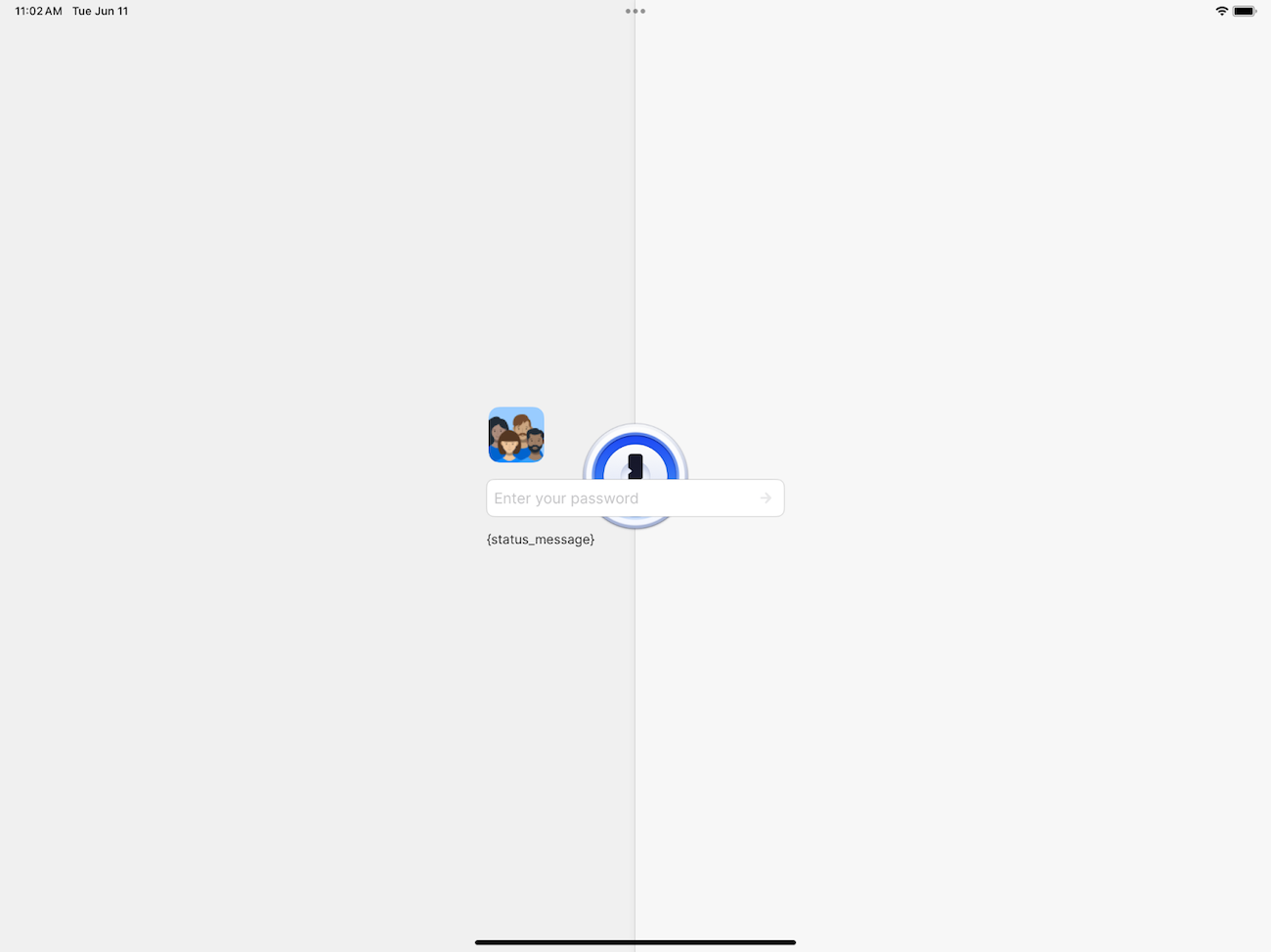
Well unsurprisingly that looks terrible. Everything is smack in the middle of the screen! We can start by fixing the 1Password logo, which should be:
- Vertically aligned to the center of the avatar row
- A fixed horizontal distance from the leading edge of the avatar row
To accomplish this, we can make use of some simple alignment guides:
var body: some View {
-	ZStack {
+	ZStack(alignment: .logoToAccountAvatars) {
    	logo
+        	.alignmentGuide(Alignment.logoToAccountAvatars.vertical) {
+            	$0[VerticalAlignment.center]
+        	}
+        	.alignmentGuide(Alignment.logoToAccountAvatars.horizontal) {
+            	$0[HorizontalAlignment.center]
+        	}

    	controls
	}
	.background { ... }
}

@ViewBuilder private var controls: some View {
	VStack(alignment: .leading, spacing: Self.controlsSpacing) {
    	avatarRow
+        	.alignmentGuide(Alignment.logoToAccountAvatars.vertical) {
+            	$0[VerticalAlignment.center]
+        	}
+        	.alignmentGuide(Alignment.logoToAccountAvatars.horizontal) {
+            	$0[.leading] - logoCenterToControlsLeadingHorizontalSpacing
+        	}
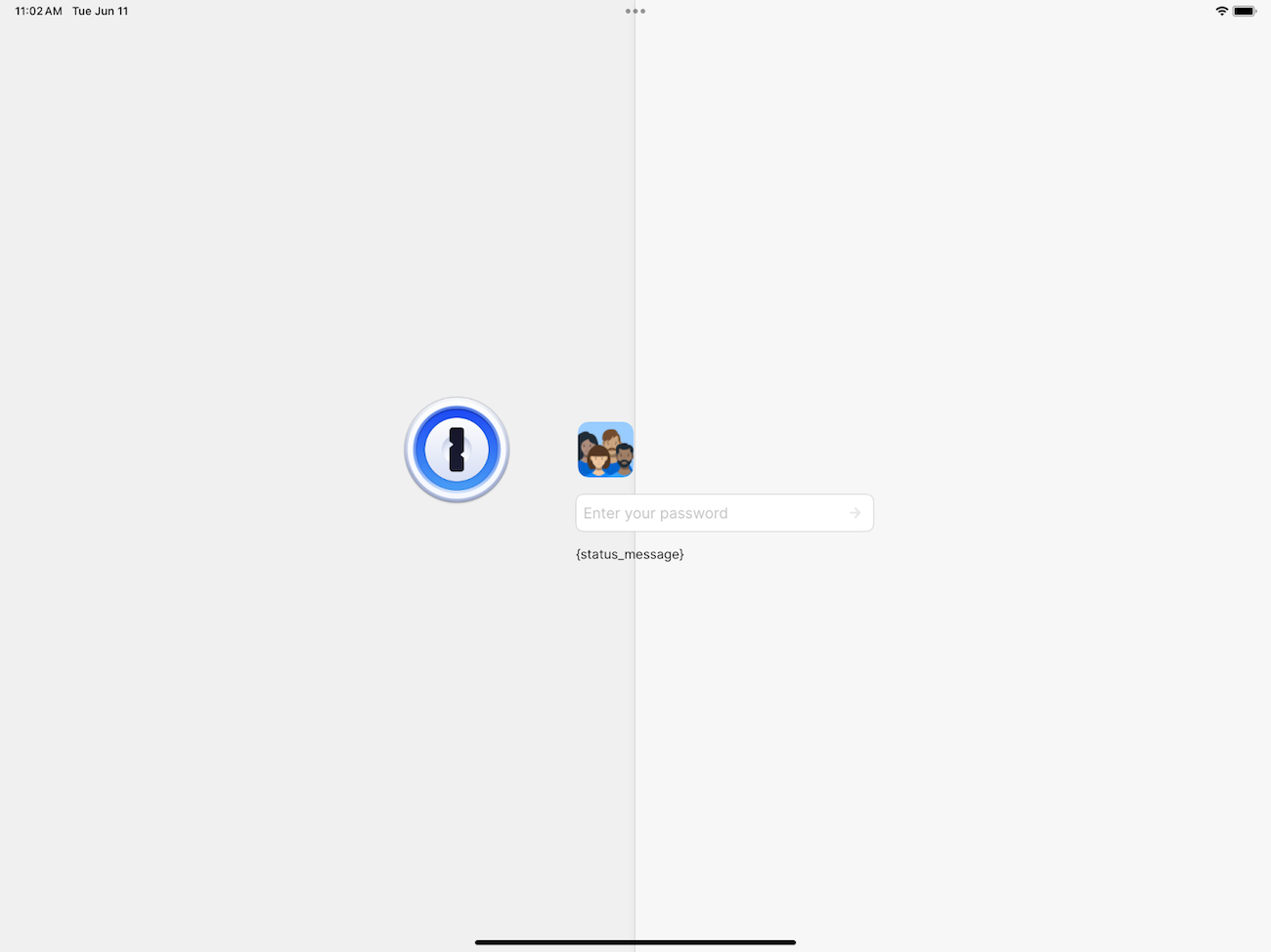
While the logo has moved to its correct position relative to the avatar row, the doors haven’t followed! We can leverage the alignment guide we’ve already created to get this right as well:
    	controls
	}
-	.background {
+	.background(
+    	alignment: Alignment(
+        	horizontal: Alignment.logoToAccountAvatars.horizontal,
+        	vertical: .center
+    	)
+	) {
    	HStack(spacing: .zero) {
        	leftDoor
        	rightDoor
    	}
+    	.alignmentGuide(Alignment.logoToAccountAvatars.horizontal) {
+        	$0[HorizontalAlignment.center]
+    	}
}
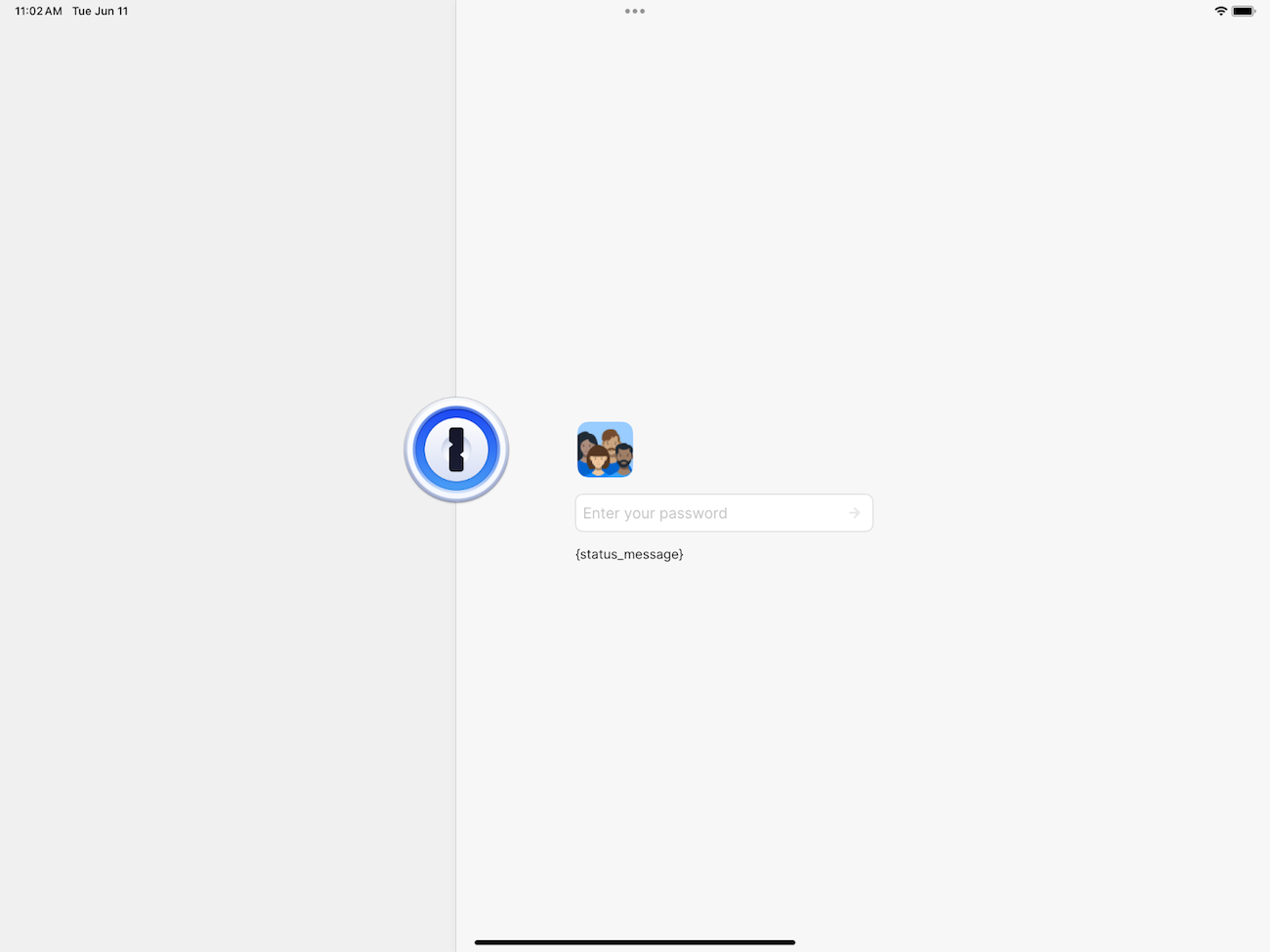
The lock screen now looks pretty close to what we want. All that remains is to properly center the password field in the middle of the screen. We know that SwiftUI will center our content by default for us… so what’s the deal here? After moving the logo to its proper position, SwiftUI is now centering the combined boundary of both the logo and the vertical stack of controls (think CGRectUnion). This means the layout of the logo is affecting the controls even though the logo’s position should be solely dependent on the controls.
We can remedy this by moving the logo into a background modifier so that SwiftUI naturally centers the controls, or by using different layout priorities.
var body: some View {
-	ZStack(alignment: .logoToAccountAvatars) {
-    	logo
-        	.alignmentGuide(Alignment.logoToAccountAvatars.vertical) {
-            	$0[VerticalAlignment.center]
-        	}
-        	.alignmentGuide(Alignment.logoToAccountAvatars.horizontal) {
-            	$0[HorizontalAlignment.center]
-        	}
-
-    	controls
-	}
+	content
    	.background(...) { ... }
}

+@ViewBuilder private var content: some View {
+ 	controls
+     	.background(alignment: .logoToAccountAvatars) {
+        	logo
+            	.alignmentGuide(Alignment.logoToAccountAvatars.vertical) {
+                	$0[VerticalAlignment.center]
+            	}
+            	.alignmentGuide(Alignment.logoToAccountAvatars.horizontal) {
+                	$0[HorizontalAlignment.center]
+            	}
+    	}
+}
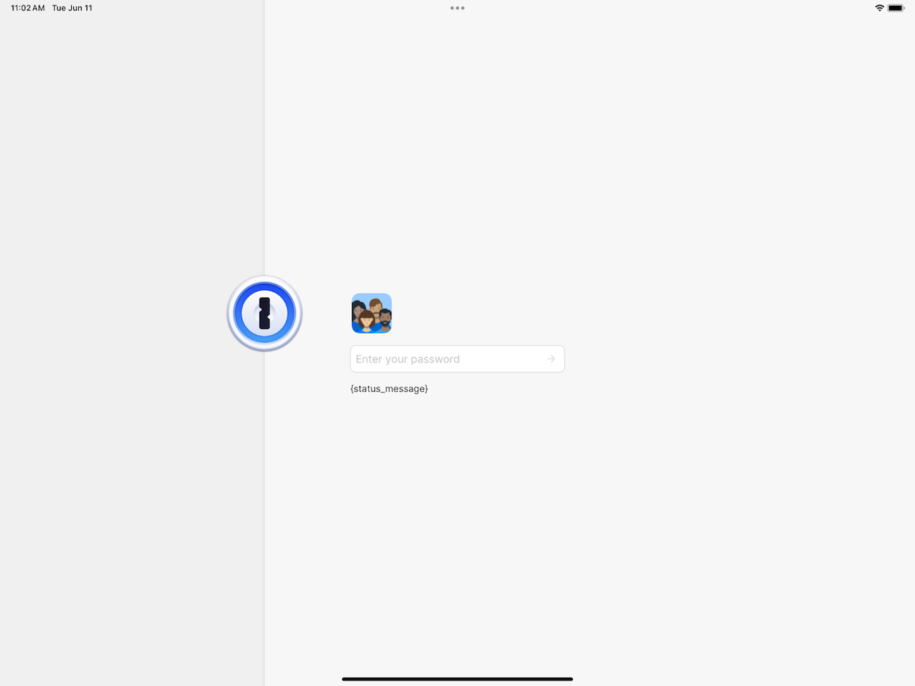
It’s looking good! However, we’re not done yet. Remember that one of the desired specifications is to have the password field centered in the screen, not the vertical stack of controls. We’re already fine on the horizontal axis since the width of the password field corresponds to the vertical stack, but not on the vertical axis.
Let’s use one last alignment guide to get that working:
var body: some View {
-	content
+	ZStack(alignment: .passwordFieldToContainer) {
+    	// Represents the container for alignment purposes
+    	Color.clear
+        	.alignmentGuide(Alignment.passwordFieldToContainer.vertical) {
+            	$0[VerticalAlignment.center]
+        	}
+
+    	content
+	}
	.background(...) { ... }
}

@ViewBuilder private var controls: some View {
	VStack(alignment: .leading, spacing: Self.controlsSpacing) {
    	avatarRow
        	.alignmentGuide(Alignment.logoToAccountAvatars.vertical) {
            	$0[VerticalAlignment.center]
        	}
        	.alignmentGuide(Alignment.logoToAccountAvatars.horizontal) {
            	$0[.leading] - logoCenterToControlsLeadingHorizontalSpacing
        	}

    	passwordField
+        	.alignmentGuide(Alignment.passwordFieldToContainer.vertical) {
+            	$0[VerticalAlignment.center]
+        	}
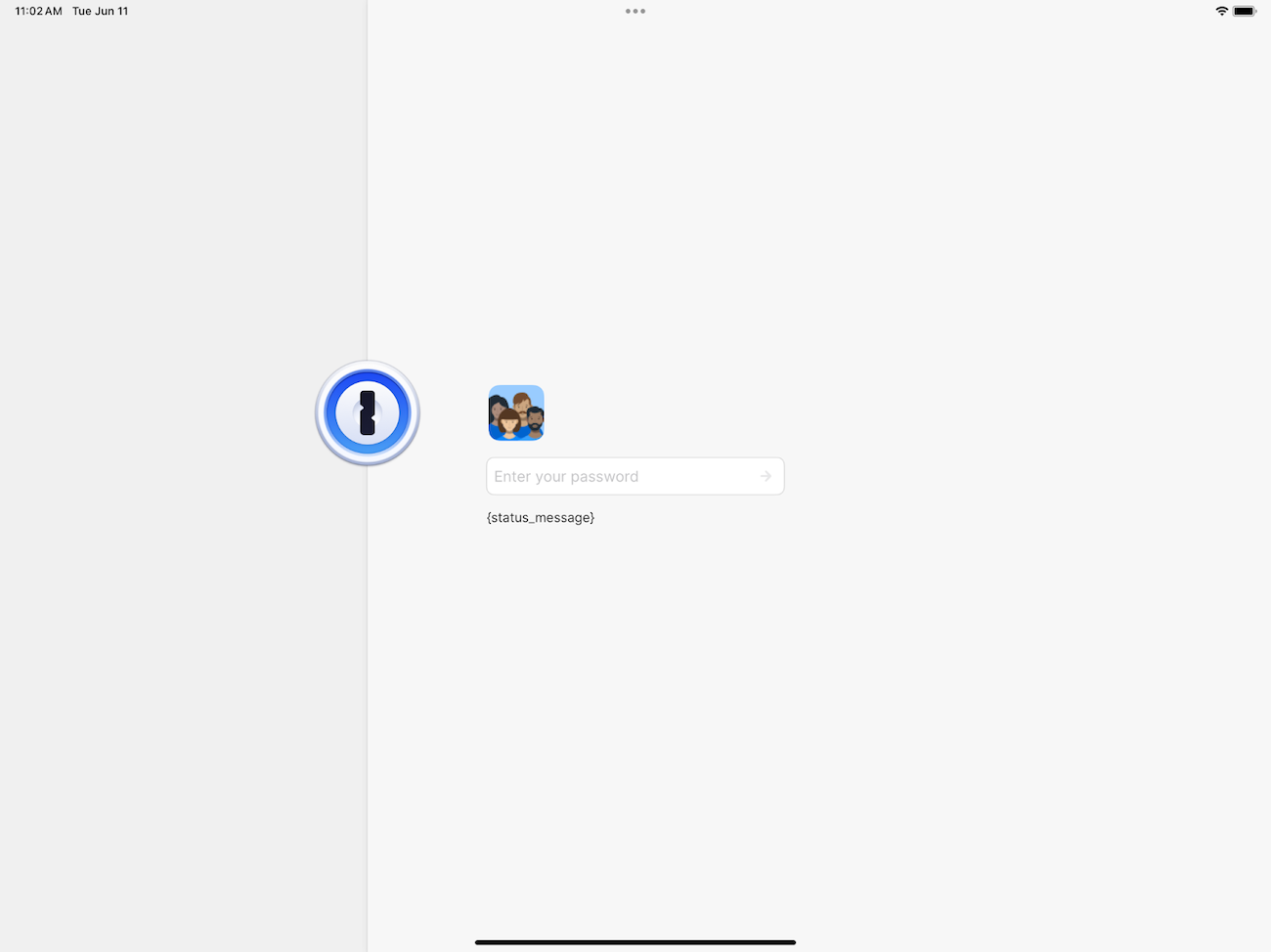
And there you have it! We’ve implemented all the required layout constraints fully in SwiftUI. There’s nothing mind boggling about the techniques we’ve used here. But the subtle decisions we had to make around how the layout system and alignment guides worked weren’t apparent when we first started out with SwiftUI. The fact it’s now so much easier to figure out and implement this layout in SwiftUI is a small testament to how far our team has grown in its understanding and usage. It also reflects our declining dependence on the UIKit crutch.
These advancements in SwiftUI, Swift, and ourselves meant it was now the perfect time to refactor the lock screen and take advantage of the simplicity of SwiftUI. With its feasibility confirmed, we began carefully rebuilding the lock screen at the start of 2024. After several pull requests, we had wrapped it all up by early March. We now have ourselves a maintainable well-oiled SwiftUI lock screen.
The wins
From an internal perspective, this new lock screen is a huge win. It’s allowed us to replace the house-of-cards UIKIt/SwiftUI hybrid implementation that we had across our app, and put us in a position where making future changes is simpler and safer to do.
When you’re designing software, seeing the future – and what changes in requirements are coming – is a superpower that every developer strives for. This refactor was an opportunity for us to simulate that superpower and design the lock screen, along with its numerous unlock methods, into a nice cohesive system.
While lines of code isn’t always the best measure, the refactored implementation reduced the amount of code we had by 973 lines. That’s a 39% decrease! And we weren’t exactly conservative with lines either! With this project, we’ve taken a major step forward in fully embracing the productivity multiplier that SwiftUI is and reducing our dependence on UIKit.
The refactor also allowed us to clear out numerous long-standing UX paper cuts. Problems that were previously difficult to debug were addressed in one fell swoop. This includes but is not limited to fixing:
- Improper keyboard avoidance
- Overlapping buttons/labels
- Excessive icon refreshes
Another benefit of this project was that it opened the door for some polishing work that we had wanted for a long time. Specifically, a smooth launch screen transition.
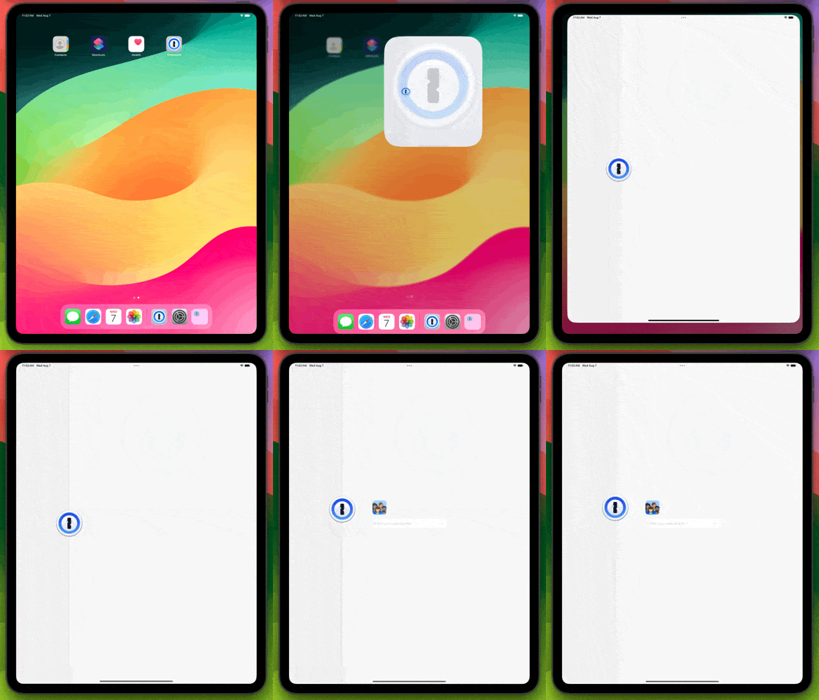
For any iOS app, the launch screen is a static screen that’s instantly displayed while it launches and quickly replaced by the first screen. For us, in order to accomplish a smooth transition, we’d need to have our launch screen match up with the initial state of the lock screen, followed by animating everything into position afterward.
This issue had been on our team’s backlog for a long time but always lost out to more important work. Once we had a more robust SwiftUI implementation, it was easier than ever to accomplish this transition with a few lines of code!
Conclusion
SwiftUI has come a long way since it was originally released in 2019. As the gaps between this new framework and UIKit slowly get filled in, it’s become easier to embrace for app development and reap the benefits of its simplicity.
While we had some challenges with our lock screen – and were forced into a UIKit implementation for a couple years – we knew that SwiftUI would eventually come around. And boy did it deliver! The journey of the lock screen is a perfect example of all the great changes that have taken place with the framework – and it’s only going to keep getting better.
WWDC24 gave us a glimpse into the future of SwiftUI, and we’re excited to figure out all the neat ways we can continue leveraging it to continue building everyone’s favorite password manager.

 by Adam Hou on


