If you work on a small team, designing by vibes (also known as intuition-based design) might feel like a natural and convenient way to get things done. The rules of design are understood, even if they’re often unspoken, and there’s no pesky documentation to get in the way.
But as your design team grows it can be very difficult to design by intuition alone. The vibe starts to fracture, and people start to produce work that looks and feels quite different. When you don’t have a shared language to pull from, your meetings get much longer or you create a very inconsistent product experience. In some cases, both. Which is frustrating for the design team and their customers.
Vibes don’t scale
To be clear, intuition is and can be a very useful tool. But when it comes to design, intuition alone isn’t enough to make good decisions. Gut feel should be a signal, but you also need to make sure you have a repeatable approach. Otherwise it’s hard to take the decisions you made in one project and apply it to other products and features.
In other words, vibes don’t scale.
Design by vibes can also make your team vulnerable to bias and stereotypes. It’s too easy to exclude entire groups of people who don’t appear in the sweep of your vibes radar.
So what do you do instead? How about some good ol’ fashioned design principles?
The principle of the matter
I have anticipated your first objection: design principles are imperfect. A quick browse through Medium or LinkedIn will reveal that not everyone loves UX principles. The common complaint is they’re easy to ignore and hard to interpret.
You can also find a similar set of articles explaining why personas are a bad idea. Yet principles and personas remain quite useful when deployed correctly. Every design thinking tool has limitations, but that doesn’t mean you can’t use them. You just have to minimize their specific weaknesses.
Speaking of which, the motivation to create new UX principles at 1Password was inspired, in part, by the need to augment our existing design values. We didn’t refer to those values as often as we should and they were open to multiple (and sometimes conflicting) interpretations.
In her book about design systems, Alla Kholmatova argues that: “Good principles don’t try to be everything for everyone. They have a voice and actively encourage a designer to take a perspective.”
She also believes that principles should be:
- Authentic
- Actionable
- Opinionated
- Memorable
As you have probably figured out, this list was a great starting point for our design team’s new principles.
Developing new principles
Work began in September of last year at a team-wide offsite. In a workshop led by then-content design manager Kate Wilhelm, our design and research team were asked to apply design principles from other companies to a handful of 1Password mockups. This “gateway drug” approach allowed the team to discuss the value of UX principles and see what it felt like to apply them to our own work.
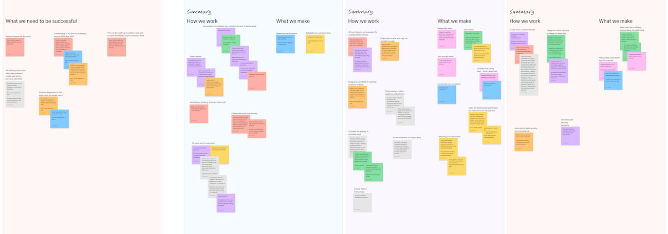
After that, a UX principles working group was formed. The group brainstormed, frameworked, clustered digital sticky notes, and gathered feedback from design leads. There were debates about what the principles should and should not do. There were debates about aspirational versus realistic principles. There was even a late stage request for a fifth principle from Steve Won, our Chief Product Officer.

Rapid prototyping with words was a critical part of the process. Boiling down complex ideas into three or four word “t-shirt slogans” wasn’t easy – I brainstormed at least 30 different options for our inclusive design and accessibility principle. But by early February 2024 the principles were complete.
The final five
And now, the moment you’ve been waiting for! Our new UX principles:
- Embrace the problem. We clearly identify the user problem that needs to be solved and keep it close to our hearts.
- Advocate for accessibility. Every day we learn a little bit more about accessibility and apply that knowledge to our product work, aiming for progress over perfection.
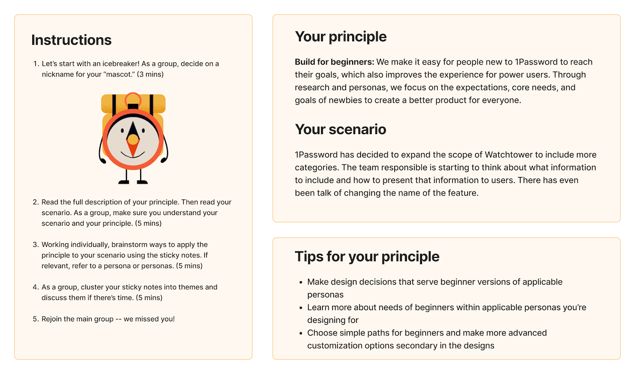
- Build for beginners. We make it easy for people new to 1Password to reach their goals, which also improves the experience for power users.
- Connect the dots. From onboarding to error messages and from desktop to mobile, we make sure users have a seamless experience.
- Iterate until it’s great. We explore multiple possible solutions and evaluate them together with cross-functional partners.
These UX principles provide a shared language and rationale across the team to help us agree and focus on key UX priorities. They are our non-negotiables, and represent the floor but definitely not the ceiling for how we work. Finally, the new principles can be applied and assessed in a clear and unambiguous manner. And, as a fantastic bonus, our new principles look amazing, thanks to our all-star illustrator Joanna Nowak.

Launch and learn
Our design and research team has grown a lot recently, so we’ve had to figure out new ways to stay connected and informed. For the past few months we’ve met every Monday for an hour. Sometimes we provide a quick update on our projects, speed dating style. Other times we learn a new skill. In mid-May, our Chief Experience Officer Matt Davey and I shared the new UX principles with the team.
To let everyone know we meant business, I wore a homemade t-shirt with our five new UX mascots.
After the big reveal we divided up into five groups. Each group was given one principle and a realistic scenario designed to put the new principle through its paces.

The exercise generated some excellent discussion and ideas. It also encouraged our team to start using our new principle-specific Slack emojis, FigJam stickers, and Zoom wallpaper. To keep the discussions going, we also created digital summary cards for each principle for use in our weekly design critiques.
We know that our mid-May launch wasn’t the end of the process, but just the beginning. That’s why we found five people to be principle ambassadors. Their job is to support the team by sharing relevant links about the principle they’re responsible for. For example:
- Embrace the problem with the five whys exercise
- Advocate for accessibility through Figma annotations
- Build for beginners with plain language
- Connect the dots by making sense of any mess
- Iterate until it’s great by managing change aversion
And we didn’t stop there. Six weeks after launching the new principles, we awarded an embroidered UX principles baseball cap to Michael McKeever, a Senior Product Designer who best embodied the spirit of the new principles.
If that sounds like a lot of moving parts, it is. But we know that without steady, gentle reminders and snazzy swag, it’s too easy to forget about UX principles. Of course, even if everyone memorizes the principles and/or puts them on a t-shirt, design utopia isn’t guaranteed. We have to continue to discuss, debate, and evolve our principles as we update existing features and build new ones. Our principles will also need to be interpreted in slightly different ways depending on our audience, what they’re trying to accomplish, and how long they’ve been using 1Password.
Our plan is to assess the success of the principles in late November of this year. We fully anticipate that our principles will need to be tweaked. Perhaps one will be removed. Or heck, maybe we’ll add a sixth principle. Because when we say “iterate until it’s great” we truly mean it.
Resources
- https://indeed.design/article/indeeds-design-principles-and-how-we-made-them
- https://jonlax.framer.ai/writing/design-principles
- https://principles.design/
- https://spotify.design/article/introducing-spotifys-new-design-principles
Huge thanks to everyone who helped develop the principles and create a rollout plan.

 by Ryan Bigge on


