When daydreaming about the future, it’s fun to imagine faraway, fantastic, and possibly impossible scenarios. Moving sidewalks. Personal jetpacks. Unconfusing TV remotes.
But to make the world a better place, we need to balance small improvements with audacious moonshots. As science fiction novelist William Gibson famously put it: “The future is already here — it’s just not evenly distributed yet.”
A good illustration of that quote can be found in Estonia, where citizens have been using digital identification to vote and access public services for over a decade. Estonia is living in the not-too-distant future, waiting for the rest of us to throw away our laminated ID cards.
Delivering these kinds of improvements is easier said than done. The paradox of working at a technology company is that you need to build small but innovative products and features (the future) with tried-and-true approaches (the past). Tight deadlines often discourage experimentation but, in order to stay competitive, it’s important to revisit your processes on a regular basis. In other words, how you build can be as critical as what you build.
The good news, according to William Gibson, is that there are plenty of new ideas out there. You just have to know where to look.
Introducing concept-first design
In that spirit, the content design team at 1Password has been trying out an approach called concept-first design.
You might be familiar with content-first design — letting the key pieces of communication (i.e. content) between the system and the user determine the shape and flow of the experience. Concept-first design, meanwhile, is a way to make sure that users won’t find those key pieces of communication confusing. Concept-first design helps simplify complex product ideas earlier in the process. This makes it easier to translate those key ideas into language and UX that users will recognize, understand, and adopt.
That’s a lot to unpack, so the rest of this article will explore concept-first design in theory and practice, the benefits of using it, and how we’re starting to apply it at 1Password.
The art of concepts
So what, exactly, is concept-first design? Let’s use Hipmunk, the late, great, travel site, as an example.
Hipmunk wanted to help users pick the best flight based on factors like the number of connections and the airline’s on-time performance. Instead of a convoluted bar graph that put the burden of interpretation on the user, Hipmunk created an Agony index. Which is almost exactly what it sounds like. Finding the right balance of pain and price in order to minimize agony was an easy-to-grasp concept for anyone who’d endured a terrible flight to save some money.
Now, in order to do concept-first design well, you’ll need to start by shifting your perspective.
As Elizabeth McGuane, a UX director at Shopify points out, concept work requires swapping Figma and Adobe Photoshop (at least initially) for design tools like metaphor and narrative. In her recent book Design by Definition, McGuane notes that “every digital product starts out as a problem to be solved. The idea, or concept, is the way we meet that problem – the premise of our solution.”
Instead of immediately pushing pixels around, McGuane challenges product designers to brainstorm a bunch of metaphors by asking:
- What materials would you build this feature with if it was a physical thing?
- What real world objects are similar to what you want to build?
- What emotional reaction should this product evoke?
As McGuane notes, “metaphors bring the abstractions of software closer to life, making interfaces feel real.” If you keep something real and relatable in mind while you’re designing software, there’s a greater chance the user will grasp the final concept and find it intuitive. (As a security company, 1Password has found the padlock to be a particularly useful bit of inspiration).
Starting with the core idea of a feature – the concept – is a way to get everyone in your company on the same page. This, in turn, allows your product and content design teams to work more effectively in parallel. A shared language gives your team a shared understanding of what you’re building and, as a nifty bonus, it makes it easier to name things too.
Speaking of which, McGuane has an entire chapter about naming in her book, which reinforces how important it is to product work. As she points out, endless arguments about product or feature names are usually due to a hazily-defined concept. Naming is hard but tech companies often make it much, much harder by starting with weak or confusing concepts.
That’s why 1Password’s content design team, with help from product marketing, has been working on different ways to improve the name game. This includes team-wide Mad Libs exercises, where we test out potential names and concepts in realistic situations. We’ve also conducted UX research sessions where we ask customers to explain what potential names mean to them.
Selling the value of concepts
Without giving away any top-secret information, 1Password plans to expand our offerings in 2024. That’s why, in the spring of last year, senior content designer Chantelle Sukhu and I gave a talk at a product manager meeting about how content design can improve the stuff that 1Password builds and ships.
As our offerings expand, it’s even more important to think carefully about concepts, complexity and clarity. To make sure everyone on the call understood the worst case scenario, Chantelle and I shared an example of concepts gone rogue:
“The Zoom Rooms Controller app provides an ideal way to manage a Zoom Room meeting without having to interact with the in-room Zoom Rooms Controller.”
That’s not an excerpt from an unpublished Dr. Seuss book. It’s actual help content on the Zoom support page. Now, to be fair to Zoom, many other companies find themselves in similar situations when product concepts aren’t thought through and carefully managed. The result of this chaos? The user is forced to learn, understand, and memorize a series of unclear concepts.
We noted during our talk that successful content design is often invisible. But users definitely notice intricate error messages, inconsistent labels, and confusing products that require complex instructions.
Successful content design is often invisible.
Along with helping product managers avoid Zoom doom and gloom, the content design team at 1Password has been working to identify and eliminate unnecessary concepts.
In the same way a product can accumulate technical debt, it can also suffer from conceptual debt. As McGuane notes in her book: “Technology companies are machines for meaning.” And too much meaning is as bad as too little. Making our products and features less confusing demonstrates user empathy and makes it easier for everyone at 1Password to do their best work.
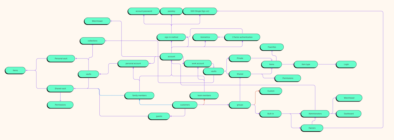
The first step of this digital spring cleaning has involved concept mapping. This is a way to visually capture the key aspects of 1Password and the interconnections between them. Creating a concept map for 1Password has helped us see the bigger picture and made it easier to integrate passkey options and identify improvements for how users sign in to our app. It’s also yet another way to create products that feel more consistent and easier to start using right away.

Applying concepts at 1Password
For all the value they bring, identifying and debating concepts can be tricky.
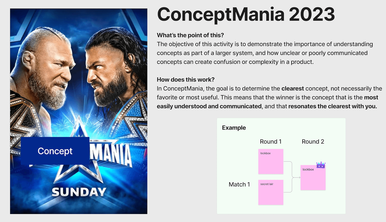
To make our naming and mapping work more tangible, 1Password content designer Grace O’Neil created ConceptMania: a single elimination tournament bracket for ideas. Working in groups, the goal was to determine the clearest concept in 1Password. The exercise sparked a lot of discussion about what makes winning concepts like “subscriptions” and “tags” easy to understand and communicate to users.
ConceptMania was fun and useful, especially because it reminded the team about mental models: a tool our brain uses to handle complexity. A mental model is a representation of how something works based on our real-world experiences. Since users bring their mental models into 1Password, our concepts need to reflect and build on those mental models.

As usability pioneer Jakob Nielsen famously put it: “People spend most of their time using digital products other than yours. Users’ experiences with those other products set their expectations.”
That’s why, a few months after ConceptMania, our design team published competitive audit guidelines. A competitive audit is a systematic look at direct and indirect competitors. It’s a way for us to spend time with products other than 1Password to better understand common concepts. And by thoroughly exploring the problem space, we can avoid being insular in our thinking and instead rely on concepts that our users are already familiar with.
Reducing content design agony
Concept-first design doesn’t solve every product problem — nor is it meant to. But it’s a fantastic way to make the often invisible work of content design impossible to ignore.
Defining, describing, and solving core product problems with a conceptual framework creates stronger connections and a clear sense of purpose between content designers, UX researchers, and product designers. And concept-first design helps avoid, or at least minimize, tricky debates about naming — which in turn reduces the content design agony index.
And, even more importantly, designing with clear, thoughtful concepts leads to products that are easier for users to grasp and enjoy.
Resources
- Using words to bring concepts to life — an interview with Elizabeth McGuane
- How to identify and reverse conceptual debt — by Nicolae Rusan
- Mental models and conceptual models in product design — by Alana Brajdic
- The pain with no name — by Abby Covert
- Start your designs with a concept — by Fabricio Teixeira
Author’s note: This blog post is based on a talk I gave at 1Password’s 2023 Product and Design offsite.

 by Ryan Bigge on

