You may have noticed that some things have started to look a little different at 1Password. Over the next few weeks, we’ll continue to roll out new elements of our brand across our website, advertising, social channels, and more. And yes, while we’ve made some visual changes to the way we express our brand, we’re still the same 1Password. The values, goals, and ethos of 1Password are the same today as they were years ago.
We’re still the same 1Password that was founded by four friends in Ontario. The same 1Password that’s committed to providing the most secure and easy-to-use password manager. The same 1Password that puts customer safety and satisfaction above everything else. And the same 1Password that will continue to lead and shape the future of authentication.
We, like the industry and technology we work with, continue to evolve and advance. In the beginning, we barely acknowledged that what we were building is not only a product, but a brand. In taking the step back to see all that we’ve accomplished, we want to recognize the efforts that have been made and crystallize our values, so that going forward, 1Password can continue to point towards the North Star we found back in 2006 when 1Password (or 1Passwd as it was known then!) was first launched.
We have big dreams and our brand needs to evolve just as our company and product have. We’ve watched our customer base evolve over the years, and we’re thrilled by the trust that millions of individuals and more than 100,000 businesses have placed in us – including some of the world’s leading brands.
1Password is now used in many countries around the world. As our customer base has evolved, we felt it was time to expand and refine our visual identity system to more accurately reflect the many ways 1Password fits into people’s lives at home, at work, and beyond. Updating our brand with a new, thoughtful set of colors and design guidelines also enables our teams to work smarter and faster. We wanted to double down on our desire to cultivate a different conversation about security. One that’s not steeped in scare tactics but focuses on capabilities and possibilities instead.
It was time to expand and refine our visual identity system.
It’s not about what you save in 1Password, it’s about what you get out of using it. When you’re not spending your time resetting passwords and worrying about security, what can you accomplish? What will you create in the world? We truly believe that with 1Password, secrets go in and magic comes out.
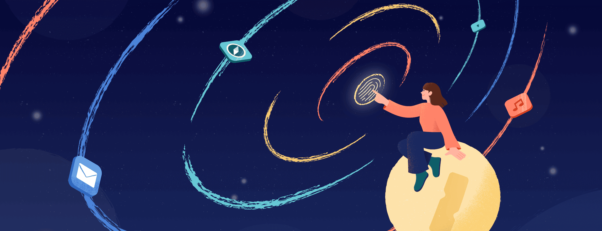
A portal of possibilities
To guide this process, we spoke to countless customers and employees about what makes 1Password special. It was crucial that we were true to the soul that has made us a trusted partner to so many people and businesses. We kept going back to this idea of trying to visually portray the feeling one gets when they use 1Password.
- How does it feel to open one of your vaults and find exactly what you need?
- What does that moment feel like when you need to pay a bill, or sign in to an account, and your credentials are automatically filled in for you?
We hear from many of you that it kind of feels like magic - and we agree! But what does that look like? Through various motion tests, we landed on an animation that shows our lock icon opening and a series of multi-colored rings bursting out of it.
The rings portray the various colors of life – and the individual approaches we all take to using the precious items in our vaults. We saw this as a portal into the human side of 1Password. This “portal of possibilities” was a core thread for us as it added energy and personality to everything we did.

For those of you who like to dig a little deeper in design decisions, we’ve broken down some of the core elements of this ever-evolving system in the remainder of this post. All of the work you’re about to see and read about was done in-house by a cross-functional team composed of members of our hugely talented Creative and Product Design teams.
Our new company logo and typeface
The 1Password logo you’ve known for years has been pulling double duty for a long, long time as both our product logo and brand logo. As we look to the future and continue to diversify our product offerings, we want to be able to differentiate between our company and our products. We needed something more agile and ultimately opted for a simplified creative canvas.
To be clear, the product icon that you’ve come to know and love isn’t changing. When you glance down at your mobile device, the app icon will be the same as before. The app icon floating in your Mac’s dock isn’t changing. And the 1Password icon in your browser is staying the same. And, when you unlock your vault, that lovely animation is, yes, staying the same.


We’ve sweated all the tiny details and built upon our trusted and distinguished keyhole, using it as a focal point for the new logo. The lock has been removed from the wordmark and placed at the forefront of the logo itself. Our refreshed wordmark is set in our bespoke new typeface, Agile Sans, making our updated logo more readable at any size. Agile Sans is friendly and trustworthy just like 1Password. It features a dash of charm and just the right amount of quirkiness.
While the logo itself appears simple, it offers us a flexible canvas we can play with. The simplicity allows it to act as a vessel for us to infuse personality and dynamism into our brand in both sensible and unpredictable ways. Whether we’re creating imagery to acknowledge important dates in the calendar year, varying how we interpret our mark to align with various partners, or just giving us a sense of playfulness by adding unexpected executions into the mix – the possibilities are endless.

An updated color palette
Our self-imposed color brief was a good balance of one part blue sky and one part constraint. Our mandates were: (1) keep our primary blue brand color (with the caveat that the value of the blue could change as needed), and (2) create a palette that was harmonious and could be mixed and matched with our Brand Blue.
The palette we ultimately landed on is made up of a tight triad of core colors – Bits Blue, Intrepid Blue, and a neutral beige we’re calling Biscuit – along with a supporting cast of vibrant accent colors, plus a few functional workhorses for backgrounds and text.

Taking a look at the before and after, you’ll notice that, relative to the previous color palette, we’ve really just made small adjustments. Our Core Blue has been desaturated a bit so it feels more tactile and almost denim-like, and the anchoring Navy (Intrepid Blue) has had its richness dialed up. The accent colors are similar to the previous palette, but they’ve been tweaked and fine-tuned to harmonize nicely with the new core colors.
Our Art Director, Lawren Ussery, led the group developing this new palette and describes the result as “a warmed-up, harmonious palette that will serve as a powerful tool in our visual toolkit driving us toward the goal of continuing to humanize 1Password.”
An expanded illustration system
Similar to the dynamism we’ve brought to our new logo, we wanted to continue to add personality to our evolving illustration system.
We’ve developed an approach that lets us tackle illustrations from a small, medium, large, and extended perspective. Each level gives us an opportunity to add different levels of narrative detail to our illustrations. This system starts with small iconography, adds a medium level of spot illustration detail, and then gives us the ability to make beautiful narrative illustrations. Finally, it gives us the scalability needed to work with outside illustrators on special projects.

We had to give ourselves some constraints in order to ensure this system was achievable and scalable. Our three mandates were:
- Build a system that acknowledges our community and reflects our human-centric, ethos-based brand.
- Create a system that gives us the capability to design at scale and maintain consistency.
- Develop a clear connection between brand and product visuals.
Finally, as with every element of this refresh, we wanted to break the mold regarding how our industry approaches the visual storytelling of security. Instead of complicated technical authentication, we wanted to focus on the positive outcomes of being secure.
We wanted to break the mold regarding how our industry approaches the visual storytelling of security.
Throughout our system, we have consistent tones of positivity, wonder, and quirkiness. In order to keep our brand look cohesive with our product illustration style, we’re adding moments of texture throughout all of our illustrations. We feel this gives us the range we need to execute both thin-lined spot illustrations and more visually rich editorial illustrations.
Putting people in the frame
To showcase the more human side of 1Password, we’re incorporating photography and live action video into our system more than ever before.
Showcasing our customers’ successes is an important story to tell. We know that on the other end of every login is a human being trying to achieve something. In one of our first refresh alignment sessions, our CEO Jeff Shiner said: “People don’t say ‘I need to authenticate with Zoom.’ They say ‘I need to get on my Zoom call.’” 1Password helps them make that call happen – and that’s just one of the countless ways people at home, in their offices, and everywhere in between benefit from using 1Password.

1Password, as a company, is all about people. They’re at the center of everything we do.
This created an exciting opportunity to portray real people using and benefiting from 1Password. Our approach is a “fly on the wall” perspective of work and life, rather than studio-lit shoots. As the year progresses, we look forward to using more and more customers in our key photographic assets.
Capturing customer stories on video offers insight into the magic they’re able to create when they use 1Password.
In addition to still photography, we’ve begun spending time with a wide variety of customers, from small businesses to enterprises, and from developers to everyday 1Password users. Hearing their stories and capturing them on video offers insight into the magic they’re able to create when they use 1Password. It’s an honor for us to be able to share these stories and celebrate all the amazing things our customers accomplish.
Bringing it all together

These pieces come together across our website, in out-of-home advertising, at trade shows, events, and more. Wherever you encounter us, it always feels like 1Password. We’re excited to see where this new direction takes us as we continue to build a safer and simpler digital future for everyone.
Thank you for taking this journey with us.
Jon Setzen
Sr. Creative Director