Greetings everyone! With the recent launch of our Early Access preview of 1Password 8 on macOS I wanted to take a few minutes to pull back the curtain on this software development project that is over two years in the making. Before we get into that, though, I think a bit of backstory is warranted.
1Password 7, 6, 5, 4…
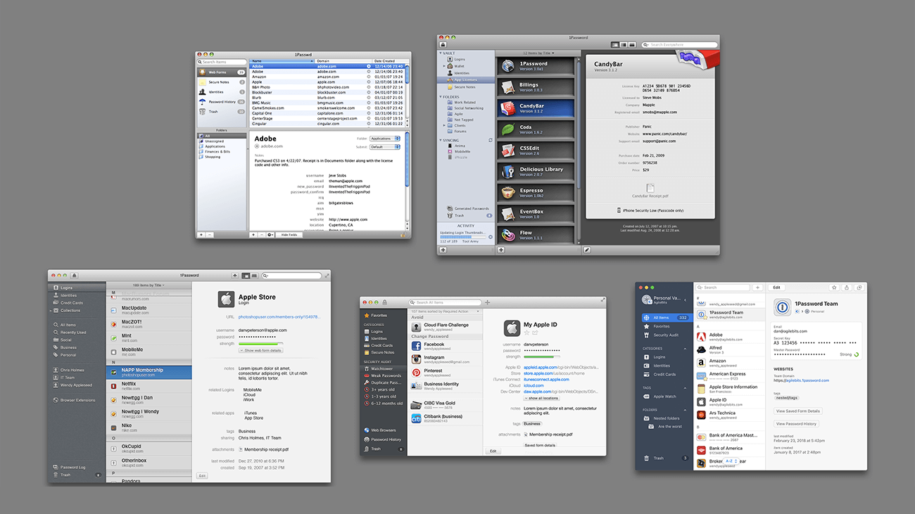
With a fifteen year history, 1Password has seen a lot of changes across all our supported platforms, but the way we’ve built our apps has largely been the same over those years. The very first version of 1Password was built by Dave and Roustem as a weekend project to help them with their day jobs of building websites. They got tired of manually filling in usernames, passwords, and contact information to test the sites they were building and figured they could build a tool to automate that. This weekend project quickly took over their day job and spawned a whole company and industry.
The first version of 1Password was a Mac app with a small team of four dedicated to it. When Apple announced the iPhone SDK that same team moved on to that platform and created the first version of 1Password for iPhone. At that time syncing your data across devices was largely relegated to using Dropbox to host an encrypted 1Password file that could be read and updated by any of your 1Password apps connected to your Dropbox account. Not long after, we expanded to include Windows and Android, hiring a developer for each of those platforms. They were given the file format specification, shown the Mac and iPhone apps, and given free-rein to create a 1Password app for their platforms. While that was happening, the original team went back to working on the Mac and iPhone apps. They added features, shipped updates, and continued on the path of making great software for Apple’s platforms. Meanwhile, the Android and Windows developers did the same, but in a manner that was very siloed from the other platform developers.
As time went on and those teams grew, that separation and mode of working remained largely the same. When I was leading the iOS team and later both the Mac and iOS team, I would routinely find out about things the Windows and Android team had done when I read about it on our blog. If I saw a new feature or improvement I thought we should add to one of my team’s apps I would do so, but in isolation from those other teams. This way of working wasn’t ideal, and it certainly wasn’t a bastion of cooperation and coordination.
History repeated itself six years ago when we introduced our hosted service, 1Password.com. The first version of the client/server application programming interfaces (APIs) were first built and refined using 1Password for Mac. Once things were stable they came to our iPhone app. We did a much better job documenting those APIs and file formats, but in the end we still delivered them to the Windows and Android teams, pointed them at what we’d built for the Apple apps, and sent them on their way to build it into their apps. Nonetheless, we shipped support for our new service across four platforms and things were good… for a while.
The 1Password.com Era
One of the things that we were the most excited about with our own hosted service was that we were going to be able to move so much faster. We could build new features and roll them out across all our apps quickly, easily, and simultaneously. However, with four full stacks of client implementations of our server APIs, any changes needed to be coordinated across four teams. Four teams that were still operating independently. Each time our server team lead would come to the client leads and ask us how long until we could support some new feature, each of us said the same thing: “Now’s not a good time, we’re busy. Maybe in a few weeks?” And that estimate of a few weeks was different for each team. We kept advancing our apps with cool new features, but we weren’t advancing our service-based features. We were paralyzed. This continued until about three years ago when Jeff Shiner, our CEO, pulled all the leads together and effectively said, “This is ridiculous. Can we do better?”
Doing Better 👉 ⌘N
We began exploring options for consolidating the non-user interface portions of 1Password into a single codebase that we could insert into each of our apps. The goal was to replace those four separate technology stacks — each with their own idiosyncrasies, differences, and frankly, bugs — with something that allowed us to move faster, together. With a couple false starts and technology changes under our belts we finally caught our stride at the beginning of last year. A small team, using existing pieces of various apps and projects, put together a proof of concept of a brand new 1Password app running on top of what we now call the 1Password Core.
On April 1st, 2020 we officially put our existing 1Password apps into maintenance mode, opened up our source code editors, and clicked File > New Project… on five new 1Password apps.
The 1Password Core Era
1Password 8 has been an incredibly ambitious project for a number of reasons. Beyond “simply” recreating an entire 1Password client app backend in a shared library, we had other requirements:
- We needed to create apps that look and feel like 1Password, but also look and feel at home on the platform where they’re running.
- Because we were starting from scratch we needed to get all our platforms moving together and coordinating from the start.
- We needed a design-led approach that was integrated with our development team much more tightly. The best software is built when the designers are sitting (virtually) right next to the developers in a collaborative environment.
- Inconsistencies both small and large had crept into our apps over time. From small things like password strength being different between platforms to larger things like differences in search results and entire missing features. We needed to drive consistency and cohesion through our apps in a programmatic way.
The Backend
As you may have read in some of our previous posts, we chose to write our shared backend library in Rust, a systems language known for its performance, security, and memory safety. It also ticked all the boxes for the platforms to which we were planning to deploy: macOS, iOS, Windows, Android, Linux, our browser extension, and our web app. Our Windows team had been working with Rust for a year before we started on the Core project which gave us a huge leg up. We also hired a large number of very talented Rust developers to help us achieve our goal.
The goal was to put every feasible piece of 1Password into the Core library, stopping just short of the user interface. This approach has allowed us to consolidate everything from the communication with the 1Password.com server, to the database handling, to permissions enforcement, to our cryptographic routines, and more in one place. It’s also allowed us to drive the consistency of user experience we need. For example, when you search for something in 1Password 8, the code that matches your search terms to your items is exactly the same across each platform, ensuring your results don’t vary from app to app.
The 1Password 8 Frontends
When we set about choosing our frontend languages we took it platform by platform, but we did have an overall goal of reducing the number of frontends for which we needed to develop which would enable us to move faster.
Linux
Our first proof of concept was on Linux, using web technologies that borrowed heavily from our browser extension implementation. We had packaged this proof of concept using Electron. With myriad windowing toolkits on Linux we decided to continue with that approach because it gave us a way to deliver a high quality application regardless of each distribution’s windowing environment.
Windows
On Windows we did consider writing an app using the native Windows UI toolkit, but given our history of Windows development and reviewing the types of rich user interface experiences we wanted to provide with 1Password going forward we decided to take the web UI approach there as well.
Android
To achieve our goal of creating an app that looked and felt like it belonged on Android devices we decided to use a native Android toolkit for our frontend. When we started the project we were hoping to use Jetpack Compose, but as it was still prerelease and lacking some key features we needed, we decided to stick with the Android View framework. Happily, in the time since we started this project, Jetpack Compose has gone stable and we’ll be exploring how we can integrate it into our future work.
iOS
Similar to Android, we knew that the best way to create an app that looked and felt like 1Password but also felt at home on the system was to use a native UI toolkit. We had two choices between UIKit and SwiftUI. SwiftUI was still early on in its lifespan, but in the spirit of skating to where the puck was going, we decided to go all in on Apple’s future-looking framework. We also knew that Apple was planning significant updates to SwiftUI that would most likely require us to increase the minimum supported version of this new app, but given the incredibly high adoption rates of new versions of iOS this wasn’t a significant concern. Using SwiftUI also gave us the opportunity to do something we’d never been able to do before: cover iOS and macOS with the same user interface code.
macOS
The decision of how to build 1Password 8 for macOS was probably the most complicated one we had to make. Given our history of shipping great apps built using the native UI toolkit Apple provides, and the ability those toolkits give us to meet our goal of an app that feels at home on the system we knew wanted to continue that trend. We had a few goals that were at odds with each other:
- Reduce the number of frontend languages and toolkits.
- Support as many versions of macOS as possible.
- Create an app that looked and felt at home on macOS.
We could support as many versions of macOS as we wanted using Apple’s AppKit framework, but that meant adding another frontend toolkit to the mix. We could go all in on SwiftUI, but that meant reducing the number of operating system versions we could support. We could go all in on the same approach we were using for Linux and Windows, but that made it very difficult to create an app that looked and felt at home on macOS.
Ultimately we decided for a two-prong approach. We would build two Mac apps. One written in SwiftUI that targeted the latest operating systems and another using web UI that allowed us to cover older OSes.
With all our frontend frameworks chosen we were off to the races!
Feature Teams
Our past approach to designing and building our apps, as I mentioned above, was much more piecemeal. A single designer would design a feature for a single platform and then move on to something else. With the power of the Core behind us and our trio of frontend frameworks in front of us, we wanted to take a much more unified approach to feature development. We came up with the concept of “feature teams” — ephemeral teams made up of a designer, three frontend developers, one or two Core developers, a project manager, a tech lead, and a member of the quality assurance team. Together this group takes a problem we’re looking to solve, defines the use cases and the scope of the project, wireframes possible solutions, and then dives into a full design and development cycle until the problems have been solved and the feature is complete.
We’ve had a tremendous amount of success with this approach because it’s allowed us to move all our apps forward together at the same time, creating cohesive user interfaces across our client apps that deviate where necessary to fit in with the paradigms, design patterns, and form factors of the system on where they’re being deployed.
Design & Development
While feature teams solved the problem of how to move together, we wanted to solve an ancillary problem at the same time which was how to create a design-led approach that connected our design team with our development team much more closely. Taking a chapter out of the design system playbook we decided to create a component library that would be matched across our frontends and design system. This allowed the designers to define reusable components that each of our frontends would implement and then use when building our features.
Cohesion
The final requirement we had was one of consistency and cohesion across our apps. For that we turned to the concept of view models. We knew that the more we could use the Core to inform the user interfaces we were building, the more maintainable they would be in the long run. A good example of this is the new sidebar in 1Password 8. Early on we had the vaults in the sidebar grouped by Private and Shared. This led to some confusion during testing and we made the decision to change to single list of vaults. Because of how we had architected the interplay between the user interface and the Core, this change required no frontend changes at all. We changed the grouping in the Core and our frontends updated automatically.
How It Started
The first eleven months of development on our new apps went fairly well. We doubled the size of our development team while also making significant progress on five brand new 1Password apps covering iOS, Android, macOS, Windows, and Linux.
Here’s how our apps looked in February of this year:
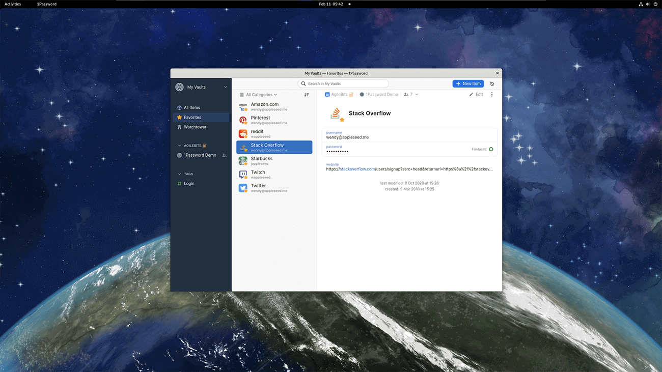
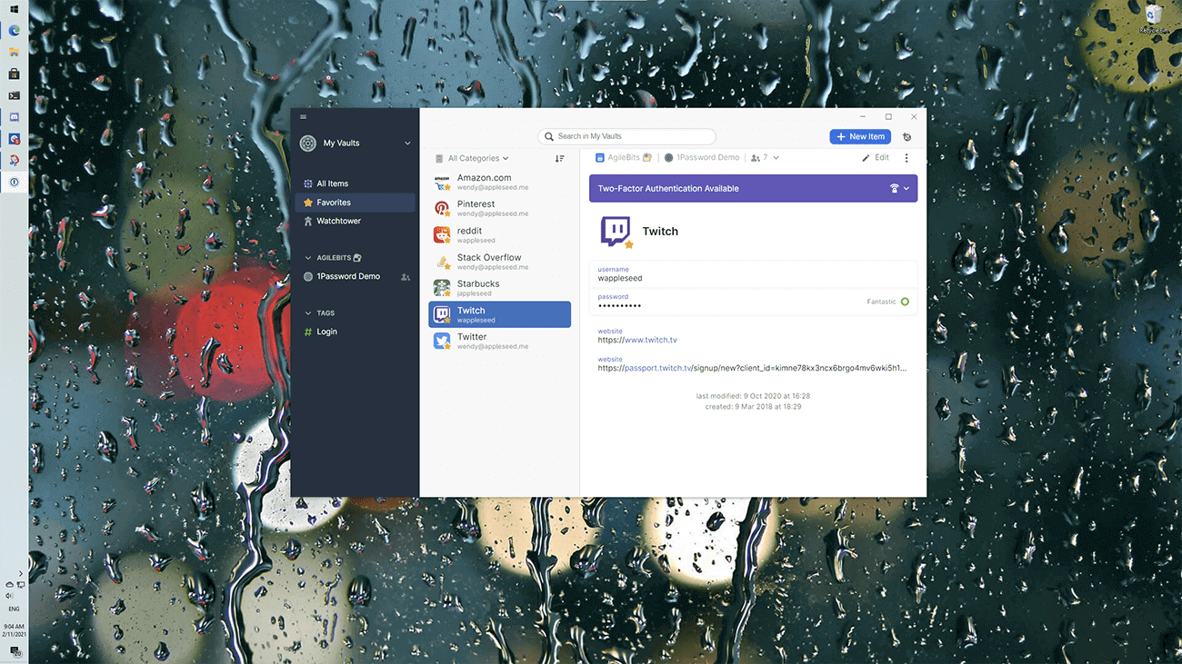
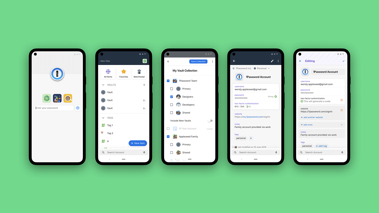
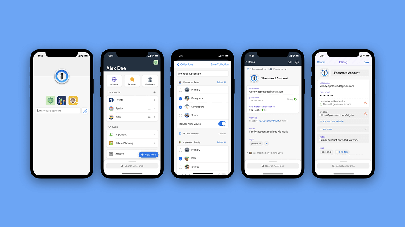
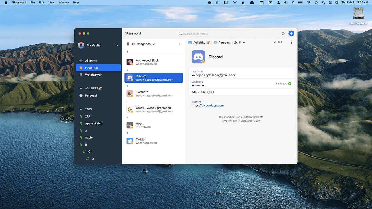
However with a self-imposed ship date of September 2021, our timeline to bring these apps to stable was starting to look a bit tight.
How It’s Going
Earlier this year the leadership team sat down to review the remaining work and evaluate ways we could reduce our scope to ensure that we were able to meet our dates. We had already decided to defer a parallel project the previous fall to port our browser extension over to the Core backend, but we knew we had to cut more to bring focus to the needs of each of our apps.
The largest and most obvious thing that we focused on was the fact that we were building not one, but two apps for macOS. Despite the fact that SwiftUI allowed us to share more code than ever between iOS and macOS, we still found ourselves building separate implementations of certain components and sometimes whole features to have them feel at home on their target OS.
Ultimately we made the painful decision to stop work on the SwiftUI Mac app and focus our SwiftUI efforts on iOS, allowing the Electron app to cover all of our supported Mac operating systems. We could have started over with AppKit as the UI toolkit for our Mac app, but this would have put us significantly behind schedule and also would have added another frontend toolkit to maintain over the long term. This decision came with a big challenge, however, as we knew we still needed to deliver a top-tier user experience on macOS.
Shortly after this decision was made, we also made another change in direction which was to ship 1Password for Linux to stable much sooner than any of our other new apps. Because this was our first ever Linux app there were fewer constraints around migrating from previous versions, supporting App Store purchases, and other efforts that were still needed for our other platforms. We rallied a portion of our team to polish the app for Linux. These efforts included adding in platform specific integrations such as GNOME Keyring and KDE Wallet support, X11 clipboard integration and clearing, and System tray icon support for staying unlocked while closed. The response to our first ever Linux app and our first ever app based on the new architecture was overwhelmingly positive. We were both bolstered and energized to move on and finish the rest of our apps.
As of this writing we have 1Password available for all of our desktop platforms: Linux in stable, and Windows and macOS in Early Access.
Where We’re Headed
Next up you’re going to see us complete the rollout of the remainder of our apps. We’ll be taking 1Password for Windows from Early Access to a stable launch, followed by the same for our app on macOS.
You’re also going to see our brand new mobile apps launch to Early Access and then stable after that with iOS landing first followed by Android.
Beyond that, though, is where the real fun begins for us and for you, our customers. With the incredibly strong foundation we’re building we will finally be able to turn almost any “what if…” into “let’s do it”.
Wrapping It Up
1Password 8 has been a huge undertaking so far, but one that is setting the stage for the next decade of success for our clients apps. We remain committed to creating top tier user experiences on all of our platforms. We can’t wait for you to come along with us on this journey.

 by Michael Fey on

